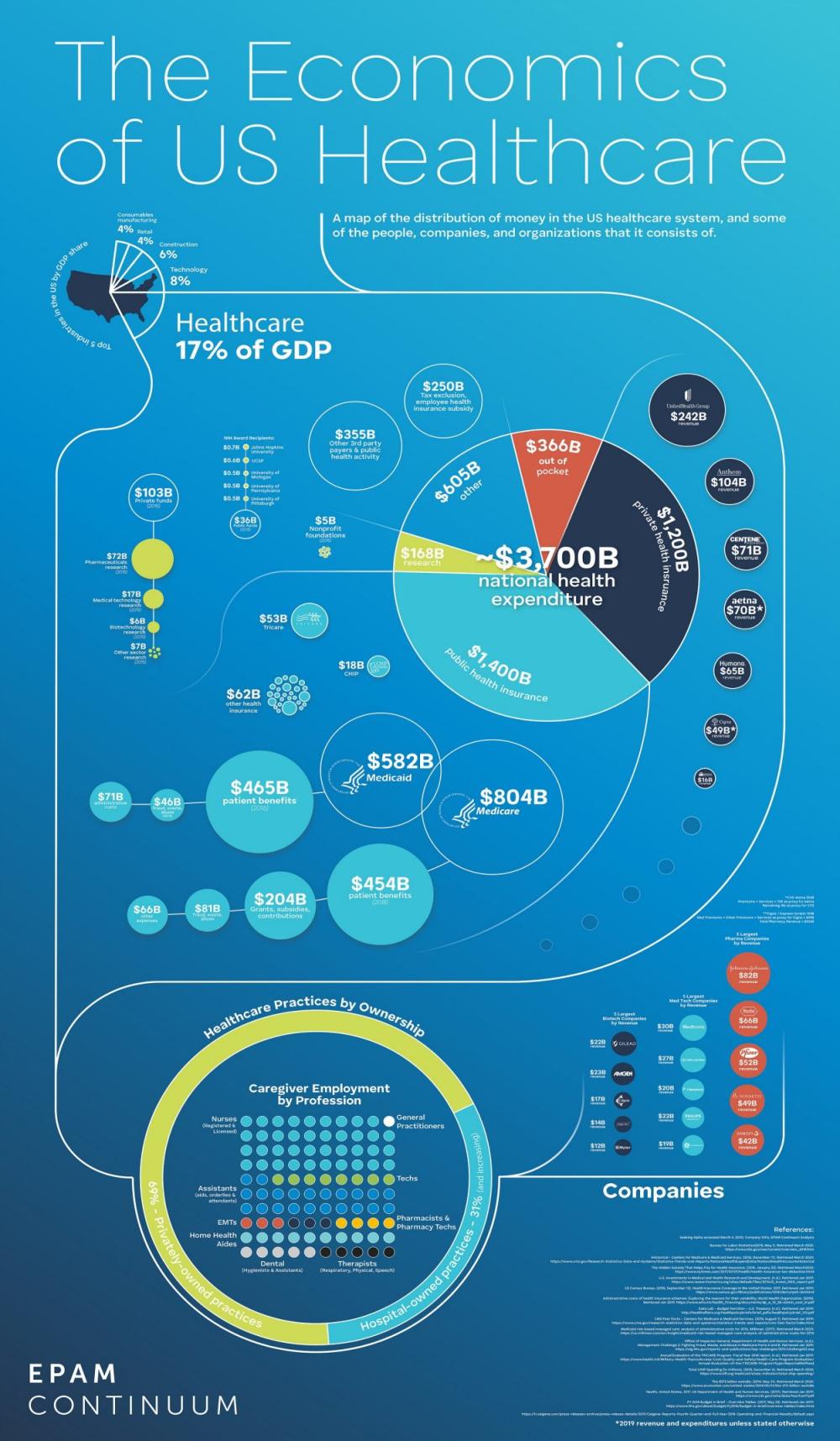
The US healthcare system is spectacularly complex. In order to gain some purchase on it—to improve our own healthcare literacy and make the inner workings more accessible—we created a visualization that begins to untangle some of the key mechanisms. We’ve started with this poster, a map of the major players behind the healthcare spending numbers; public and private, payers and providers. View the full-sized infographic on EPAM.com.
filed in: healthcare