Ferdinand Ulrich is obsessed with typefaces. Specifically, Hunt Roman. He devoted a year’s time and his graduate thesis from the Berlin University of the Arts to the character set, and Continuum was lucky enough to host him for a lunchtime lecture at our Boston studio.
First, a bit more about Ferdinand: he also studied at the Carnegie Mellon University, School of Design and teaches at Burg Giebichenstein University of Art and Design in Halle, Germany. A graphic designer and adjunct lecturer, he’s also the assistant to Erik Spiekermann, where he experiments in the letterpress workshop P98a, printing posters and other projects. A note about the press’ name: they are dubbed after the streets they are on, so you’ll find this spot at building # 98 A Potsdamer Straße.
Ferdinand shared his passion for typography with us through a brief overview of some recent experiences he’s had with fonts—such as a trip to Cuba, where the ban on advertising provides an interesting stage for retail signage and lettering to experiment with form in their written communications. He encountered the typeface Super Grotesk (which resembles Futura), which was common in the eastern parts of Germany. The typeface likely made its way to Cuba after the war.
So what’s the connection to—and obsession with—Hunt Roman? Just as he was curious to learn the history of the adoption of Super Grotesk in Cuba, Ferdinand encountered Hunt Roman in a small printing corner at Carnegie Mellon and wanted to know more. It was never digitized, and only 4 sets of it in 4 sizes existed. Rather than explore only the technical construction of the font, Ferdinand set on a course of research, which would yield his masters’ thesis, “Hunt Roman Geneology,” a 300-page book outlining the history and use of Hunt Roman.
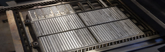
Digging into the backstory at the Hunt Institute archives, Ferdinand uncovered that the typeface was designed by Hermann Zapf in 1962; Jack Stauffacher, then typography professor at Carnegie and typographic adviser to Roy and Rachel Hunt, solicited Zapf’s help to design an exclusive typeface for the institute’s publications. It was called Z-Antiqua and was cast at D. Stempel AG in Frankfurt in 4 sizes, then shipped to Pittsburgh, where it was used for 17 years. Then, it became too costly to print using metal type.
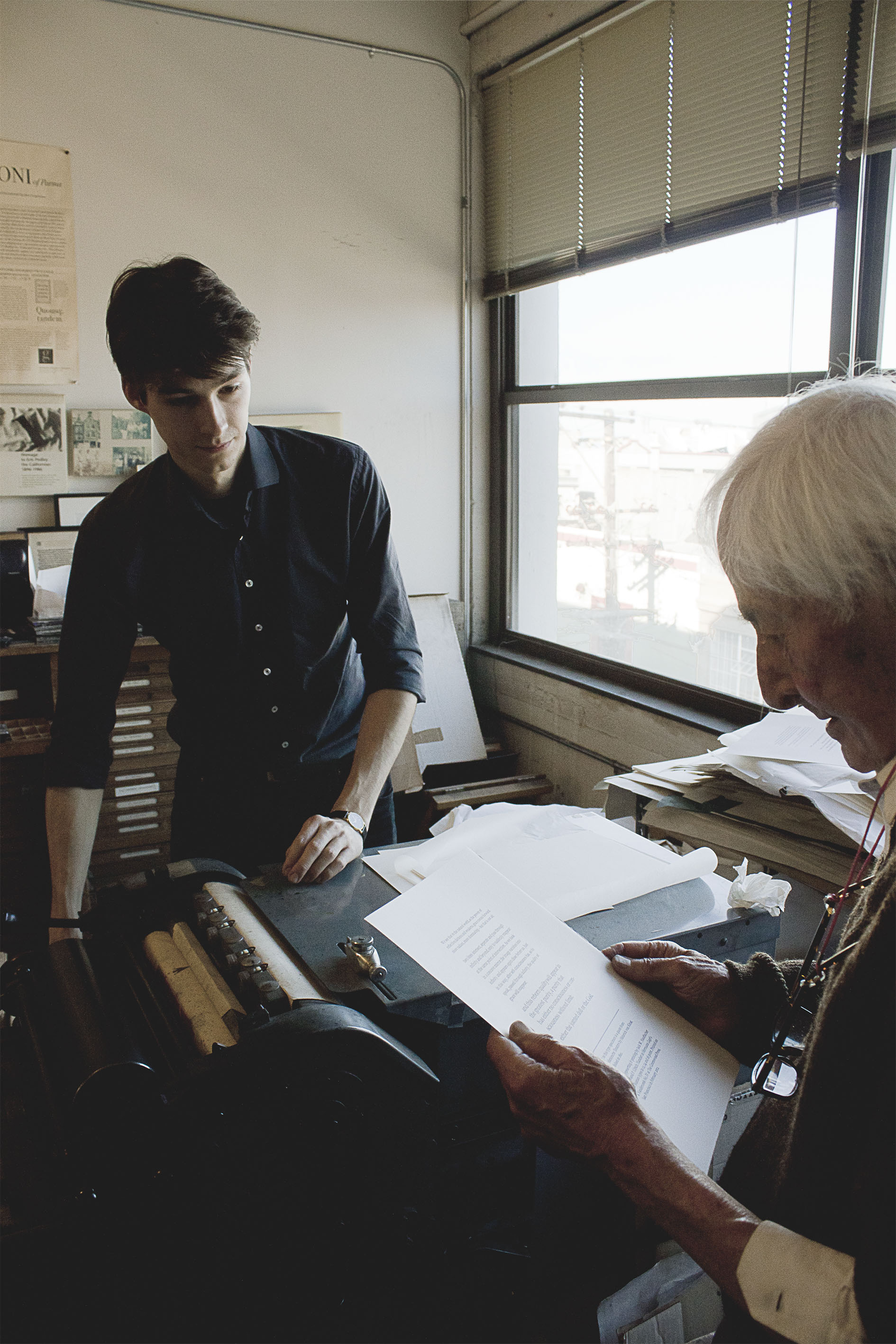
Ferdinand printing with Jack Stauffacher.
Printing shops sought exclusive rights to use the typeface, including the Hunt Institute at Carnegie Mellon. It still exists at a workshop where students can use it—which is where Ferdinand discovered it.
He had the fortune to reach out to Jack Stauffacher, now in his 90s, who recommended that if Ferdinand really wanted to learn the history of the typeface, he should come to his studio in San Francisco—so he visited for a week and learned more about the collaboration between Zapf and Stauffacher, who then contributed the forward to Ferdinand’s book.
Ferdinand also met Hermann Zapf and was able to interview him and his wife. Zapf describes Hunt Roman as“transitional”—a style designed between the renaissance and modern period in type design. It embodies shapes common from the renaissance era, partnered with weight contrast in letters of the modern design.
Zapf saw Ferdinand’s interest and dedication, and when Ferdinand asked if he might cast the typeface, Zapf gave him the green light. There is one man left in Germany who can cast type, Rainer Gerstenberg, who dropped his other projects when this one came up in August, 2014.
Now, 5 collections of the typeface exist.
Banner image source: P982.com
About the Author
 Allison RyderCommunications & Content Lead
Allison designs media communication strategies that share Continuum’s thought leadership, methodologies, and key differentiators with the world. She’s partnered with colleagues to develop articles for HBR, The Wall Street Journal, TechCrunch, and WIRED. She’s most passionate creating content that engages, educates, and inspires her audience.
With a background in video production for online learning, Allison's happiest peering over the shoulder of a designer, coaching speakers from behind a camera, or crafting video narratives in the edit suite.
She holds a BA in German and film studies from Bowdoin College and a graduate certificate in project management from Northeastern University.More from Allison Ryder